This blog works as my digital portfolio and reflective journal during the course 'Designing Interactive Artefacts' at the IT University in Copenhagen in Spring 2018.
It will contain weekly updated reflections on following course related activities:
Theory: Critical reflections on provided literature.
Practice: Documentation and reflection on design action.
Inspiration: Reflections on relevant related work.

/ EXAMINATION /
06.06.18
A THOERETICAL CONCERN, WHICH RELATE TO OUR DESIGN
One visitor at the exhibition asked this question:
“Is it even possible to illustrate a genuine sense of social anxiety through a design that is so individual? ”
I found this question very interesting and it led me to following question:
Is it even possible to illustrate a genuine sense of social anxiety through a design that is so individual?
With this question in mind, I would like to dig a bit deeper into what inspired me and motivated me the most about this course.
What inspired me and motivated me the most about this whole process was working with a combination of experience design by Hassenzahl and emotional design by Norman and learning how to create and shape experiences through technology and how to deliberately design for these experiences.
This theoretical knowledge gave me a deeper understanding on socially- or human driven innovation where you only use the technology as infrastructure
I really like the idea of a product where the product is not the important factor, but where the main focus become a meaningful experience and I was inspired by, how we as designers are able to become authors of stories conveyed through our designs.
Gaining this theoretical knowledge was a very motivating factor for me.
Already in the beginning of process of making our prototype BLOCK OFF, we deliberately choose to design for an experience.
We wanted BLOCK OFF to be a post-materialistic interactive artefact.
Not so much a tangible object, but a story transported or told through an object - a "material tale" or "psychosocial narrative" you could call it.
Hazzenzahl offers a simple conceptual model of Why, What and How as a starting point, when designing the affordances of an experience through the interaction with an object:
The What: is the things people can do through an interactive product - It is the functionality that is able to provide the experience.
The How: is the appropriate way of putting the functionality INTO to action in an aesthetically pleasing way.
When you are designing for the What and the How you do not necessarily reflect upon the underlying needs, emotions, and associated practices.
The Why tries to clarify the underlying needs, emotions and associated practices involved in an activity.
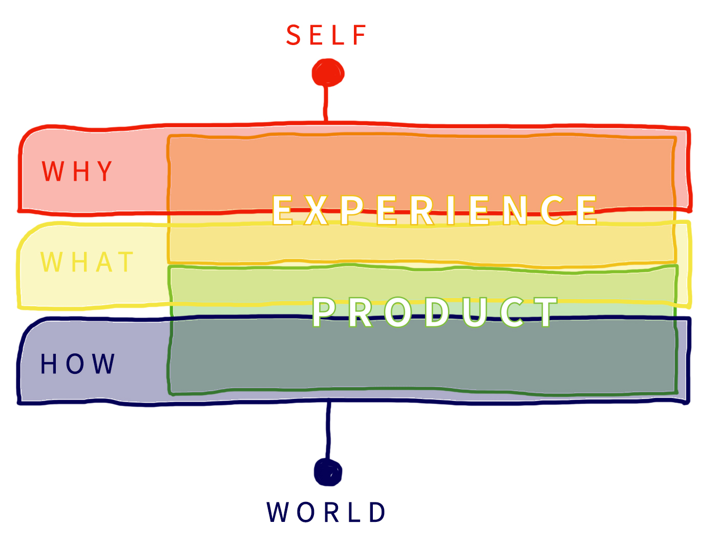
Experience Design wants the Why, What and How to chime together, but with the Why setting the tone.
It leads to products able to tell stories through their use or consumption, but also to products which are sensitive to the particularities of human experience.
We, as humans, are conscious of our role in the world and we can reflect upon past experiences.
Donald Norman has made a study of emotion, that suggest that these human attributes result from three different levels of the brain:
1. The automatic, prewired layer, called the visceral level
2. The part that contains the brain processes that control everyday behavior, known as the behavioral level
3. And the contemplative part of the brain, called the reflective level.
These three levels can be mapped to product characteristics in a simple, but useful way like this:
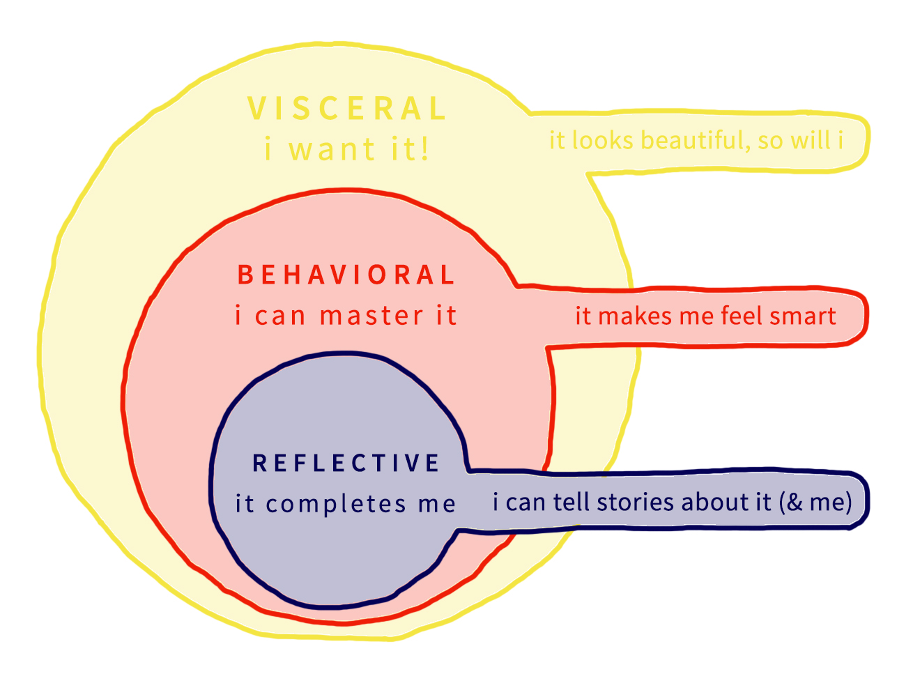
Each of the three levels each plays its part in shaping the experience of a design.
Our intention with BLOCK OFF was to awaken feelings and to tell a story. We wanted our design to give an immediate emotional impact on its audience and therefore we primarily explored the visceral- and reflective level of Norman’s emotional system.
In hindsight, it might have been beneficial for our design, if we have focused more on the behavioural level….But maybe the reflective value outweighs some of the behavioral difficulties.
All this leads me back to the question about:
What kind of emotional experience BLOCK OFF offers its user?
Asking myself this question, made me think once again about the exhibition and how the visitors perceived our final prototype.
According to Norman the essence of reflective design is, that reflective design is all in the mind of the beholder.
Hassenzahl says that an experience is subjective and as the exhibition visitor, which I quoted in the beginning also stated, BLOCK OF is a product which is very sensitive to the particularities of human experience.
As a user of BLOCK OFF you are participating in an interactive experience - you are both interacting and perceiving.
But what occurred to me, as a new thought - looking through all the video material and photos from the exhibition, once again, was that the user is also a performer.
I noticed, that the user’s of BLOCK OFF were simultaneously engaging in three actions:
1. The act of interacting
2. The act of perceiving
3. The act of performing
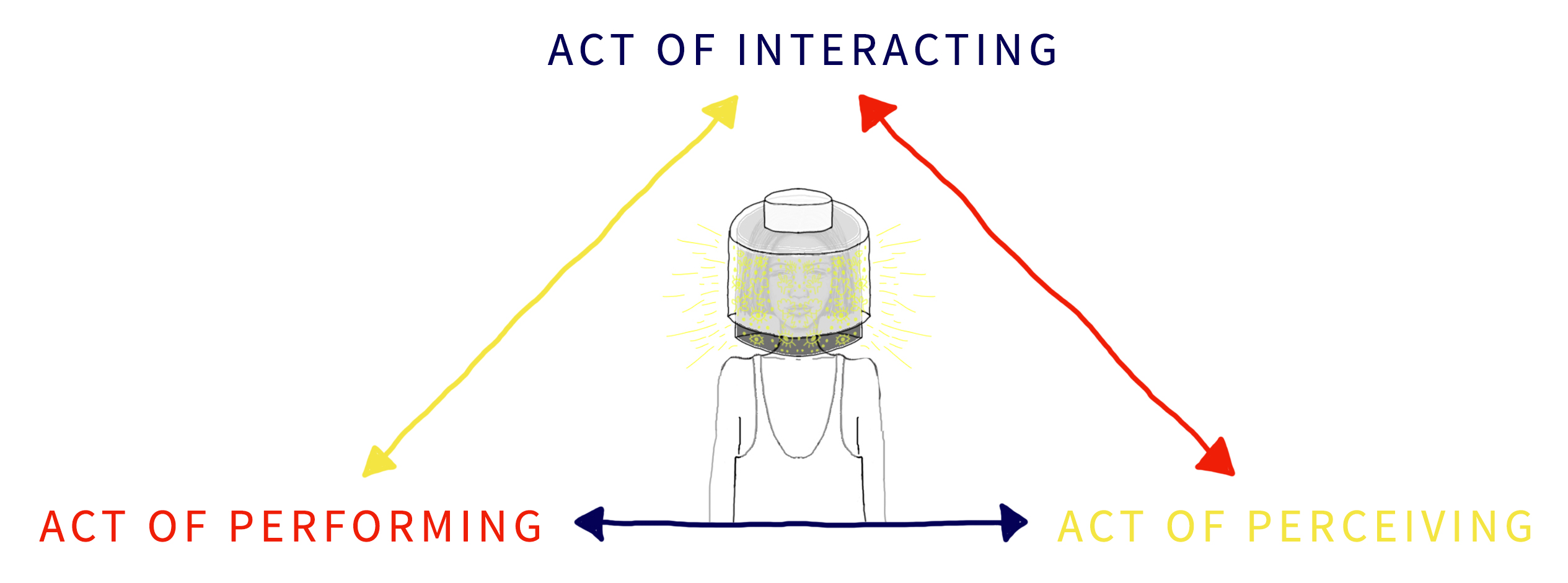
The user of BLOCK OFF is more than just a user, because using BLOCK OFF is a matter of being an operator, a spectator, and a performer all at once: as a user of BLOCK OFF, you are both operating an interactive system, a spectator of your own actions and performing for other people while operating and spectating.
So, as a user of BLOCK OFF, you are continuously and simultaneously acting out three kinds of participant roles and your awareness of all three roles are this way shaping your emotional experience when interacting with BLOCK OFF.
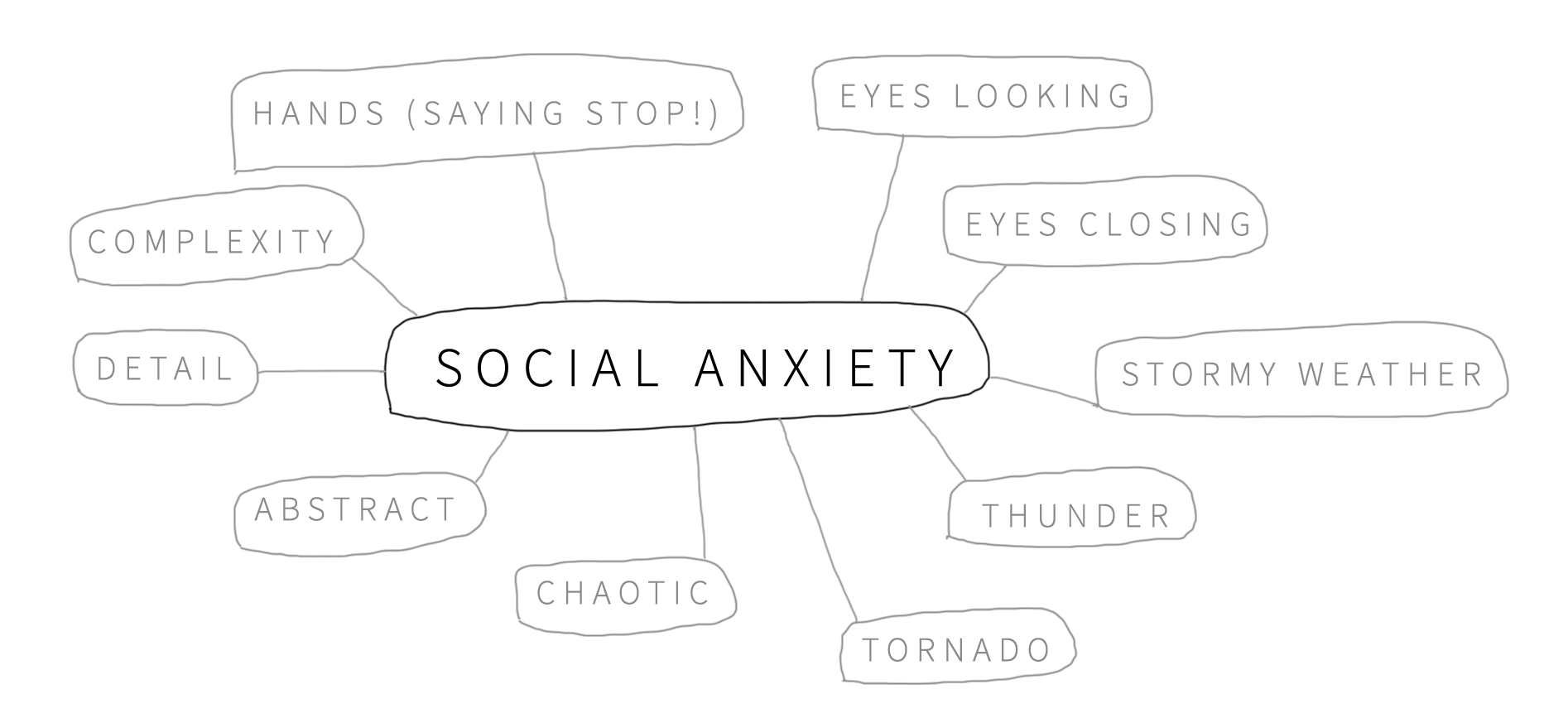
The act of performing: means that you as a user, are being put on the spot, when engaging with BLOCK OFF. This leads to an uncomfortable feeling, for a lot of people -even if you are suffering from social anxiety or not.
And the fact that the user plays out 3 different participant roles: adds to the feeling of chaos and this emotional state was also a big part of our intended story.
It is impossible to answer if BLOCK OFF gives its users a feeling of social anxiety, because as Hassenzahl says: an experience is subjective and as Normans say: reflective design is all in the mind of the beholder, so to answer the question asked at the exhibition:
I do not know if it is possible to illustrate a genuine sense of social anxiety through a design that is so individual.
But this uncomfortable feeling when you are being put on the spot and the feeling of chaos when you are interacting out 3 different roles, adds to the psychosocial narrative that tells the story about how it feels to suffer from social anxiety. This extra role, as a performer, adds an extra - and important layer to the emotional experience.
Hassenzahl points out that experiences can not be designed, BUT they can be supported. In other words, we can design in the affordances of experiences, but in the end, it is up to the people who use BLOCK OFF to have the experience. And as Norman says: no single design will satisfy everyone.

/ SUMMARIZING ENTRY /
"What happens inside your mind when you are not feeling comfortable in a specific situation and when you feel the need to block off from the world around you?
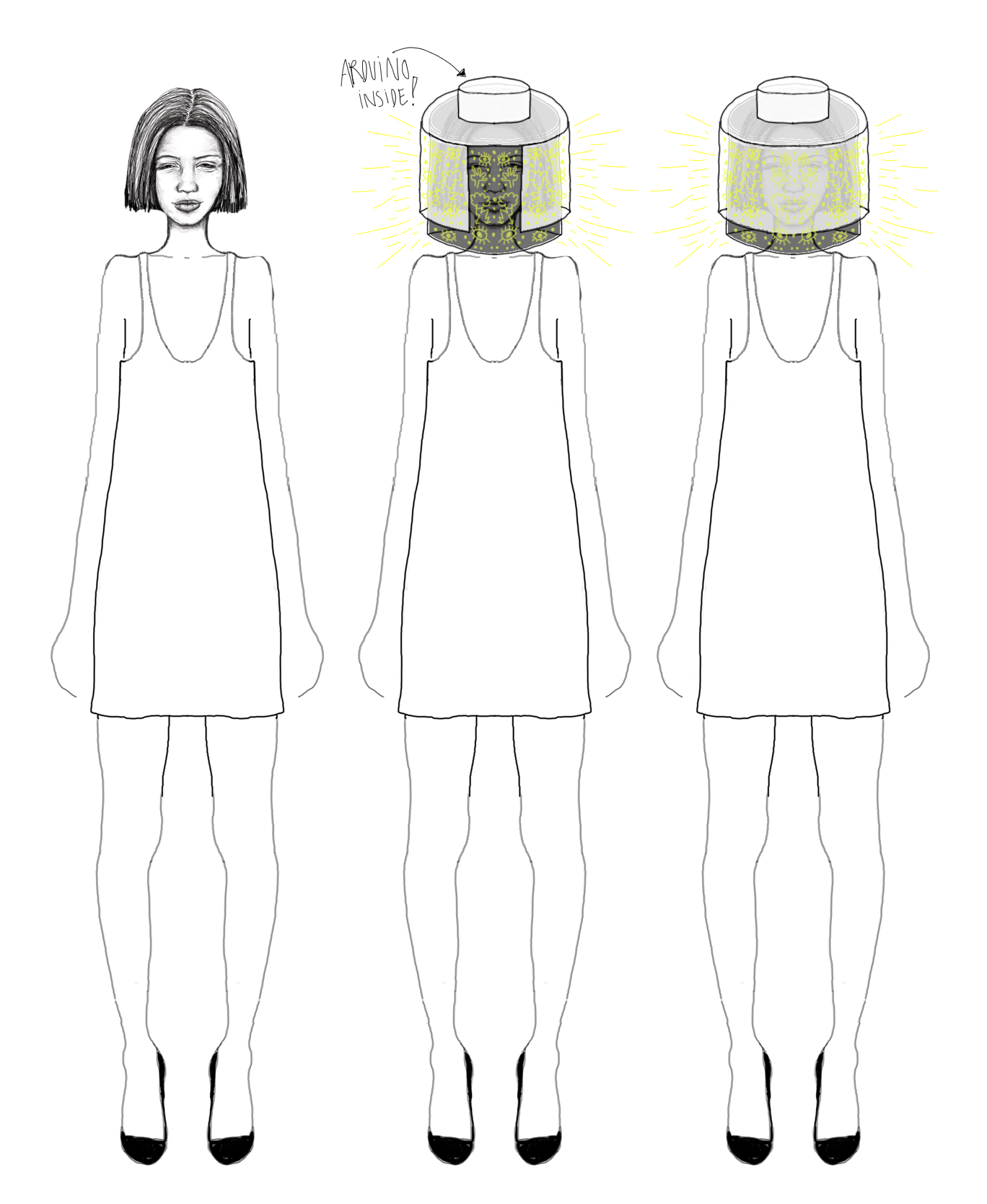
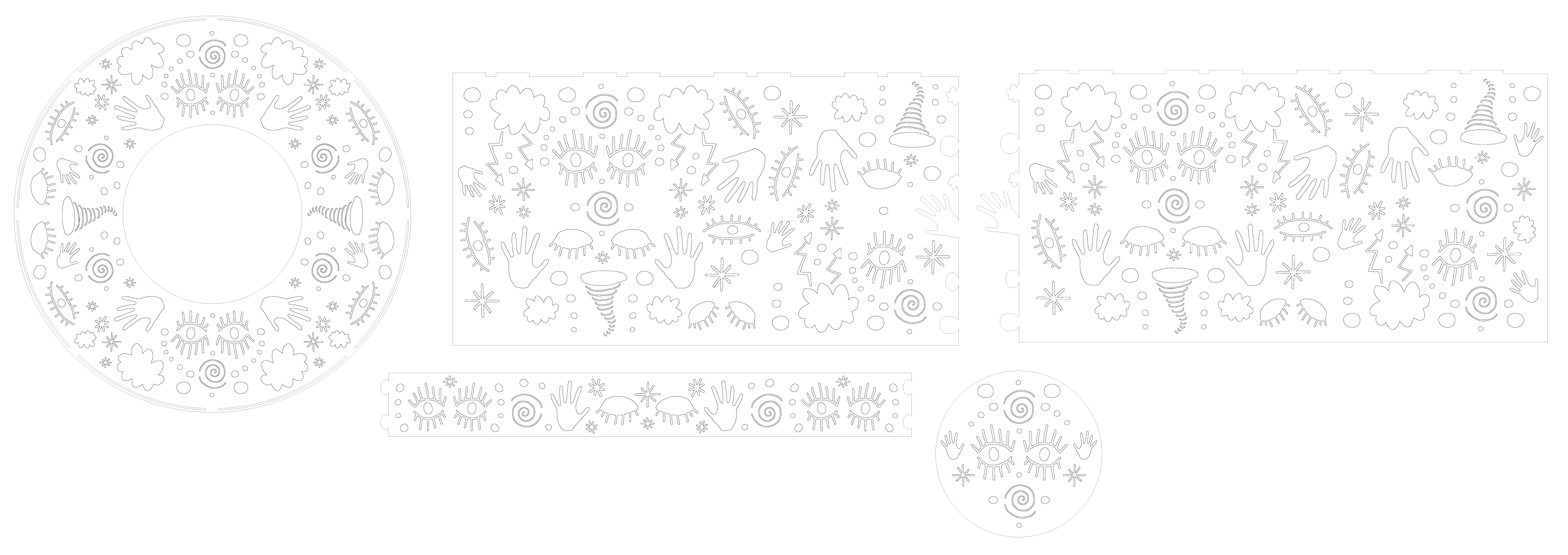
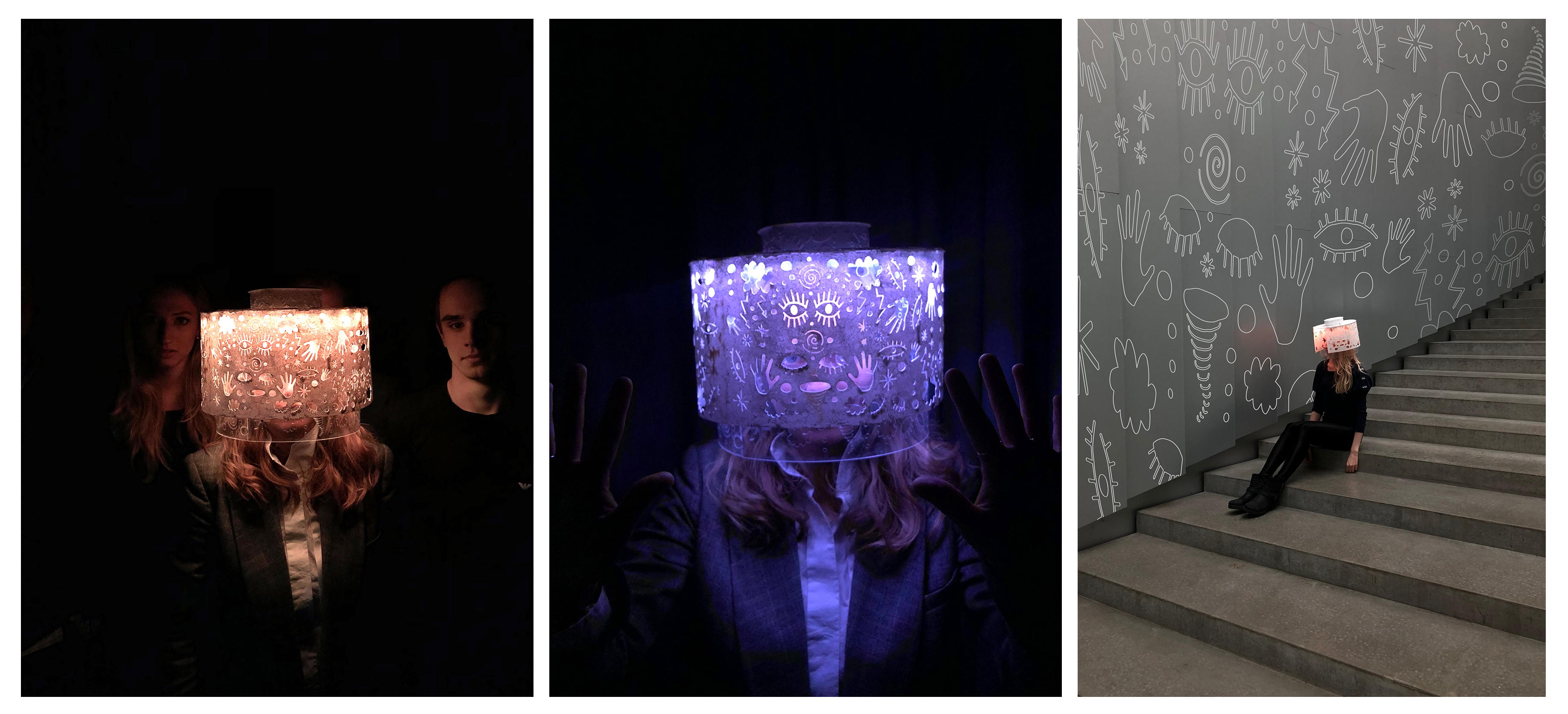
This light design - BLOCK OFF - aims to express and shine light on the uncontrollable feeling of chaos that arises inside your mind when you feel the need to block off the world - something that can happen when suffering from e.g. social anxiety.
The shape is kept simple but has a laser cutted symbolic pattern, which in a very detailed, but abstract way reflects the story behind this wearable light design."
*****
(Text written for the exhibition)
The closing exhibition worked out as an instructive and valuable day and as a natural closing for our project. Through observation, we gained a lot of insights and as a result, the exhibition was a good opportunity to practice the articulation of our design project and to evaluate to what extent the visitors experienced the interaction with our wearable interactive light design.
(Recommended read: EXHIBITION / 08.05.18)
These learnings worked as an incitement to take a step back and to take a closer look at our final wearable interactive design, our process and how it as a whole relates to the course syllabus.
HOW DID THE DIFFERENT THEORIES INFLUENCE OUR DESIGN AND OUR PROCESS?
During our design process, we slowly got a shared design vocabulary in our group. By having two of Dalsgaard et al.’s (2013) three categories in terms of grounding and argument in mind, reminded us throughout the process to formulate valid claims for our design decisions and to continuously ground our design arguments through theoretical concepts and material experiments.
(Recommended read: DESIGN ARGUMENTATION / 31.01.18)
This shared language made us able to explain and develop practical reasoning and to evaluate which argument had more explanatory power throughout our discussions. During the design process we learned to build and test arguments as we continuously created structured exchanges between our explorations and experimentation, the sketches, the prototypes and the theory. We continually collected new knowledge through the process by using our wearable interactive light design as the driving force to gain new theoretical and methodological knowledge.
In the beginning of our design process we were inspired by social interaction as a starting point. We were also interested in working with material exploration and aesthetic interaction.
(Recommended read: PROJECT WORK / 20.03.18)
I guess, the theoretical knowledge that inspired me the most was working with a combination of emotional (Norman, 2004) - and experience design (Hassenzahl, 2013).
This theory gave me a deeper understanding on socially- or human driven innovation where you only use the technology as infrastructure, where the product is not the important factor and where the main focus become these meaningful experiences. I was inspired by, how we as designers might be able to become authors of stories conveyed through our wearable interactive light design. Gaining this theoretical knowledge was a very motivating factor for me.
(Recommended read: EXPERIENCE DESIGN ACCORDING TO MARC HASSENZAHL / 20.02.18)
We wanted our wearable interactive light design to awaken feelings and to tell a story. We wanted it to give an immediate emotional impact on it’s audience and therefore we let the visceral- and reflective level of Norman’s (2004) emotional system influence our design.
(Recommended read: DONALD NORMAN (2004): THREE LEVELS OF DESIGN / 05.03.18)
Our project turned out to be more design-and art driven than user driven and worked as a vehicle to mobilize our theoretical and methodological knowledge which we gained along the way. So, is it even possible, when looking at- or interacting with ‘BLOCK OFF’ to figure out how to interact with it?
According to Norman (2013) affordances determine what actions are possible and they have to be discoverable. Perceived affordances help people figure out what actions are possible without the need for labels or instruction.
(Recommended read: FUNDAMENTAL PRINCIPLES OF INTERACTION ACCORDING TO: DONALD NORMAN/ 09.02.18)
‘BLOCK OFF’ afford either standing on a table our put on one's head. I guess this affordance could be a bit difficult to figure out, and in hindsight, some means of signaling could have been added to our design and this way contributed to communicate where the action should take place.
The outer layer affords being turned around and although it has a lot of cutouts, it still affords the ability to block off. On second thought, some kind of conceptual model would have helped the user to figure out how to interact with the artefact.
The detailed semiotic cutouts offers augmented feedforward even before the user’s action takes place and even before the light is turned on. When you look at these signifiers you already start to get some expectations on how the total experience is. When the light is turned on, the augmented feedback only becomes clearer and more alive.
‘BLOCK OFF’ also offers a clear functional feedback in form of the four different light stages: Hectic, Medium, Semi Easy and Easy when the outer layer is being turned around. In hindsight, the functional feedback could have been a bit more fluent (the transition between the four different light stages: Hectic, Medium, Semi Easy and Easy), but I think, that this augmented feedforward and functional feedback is the essence of this wearable interactive light design and the part that.
(Recommended read: SKETCHING IN CODE / TEMPORAL FORM)
(Recommended read: EXHIBITION/ 08.05.18)
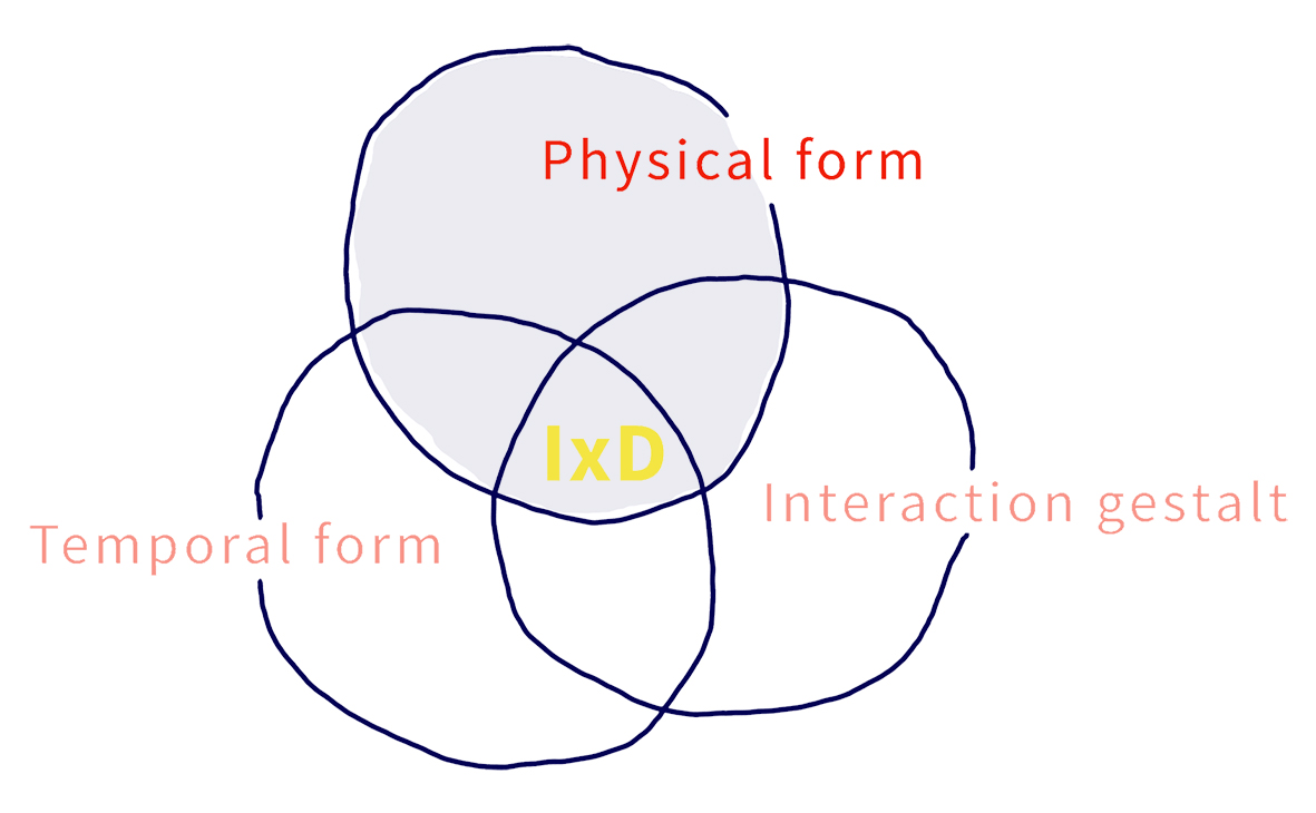
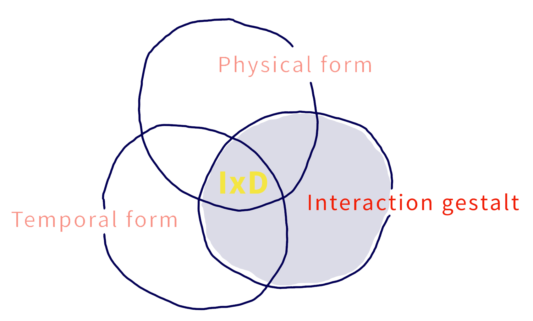
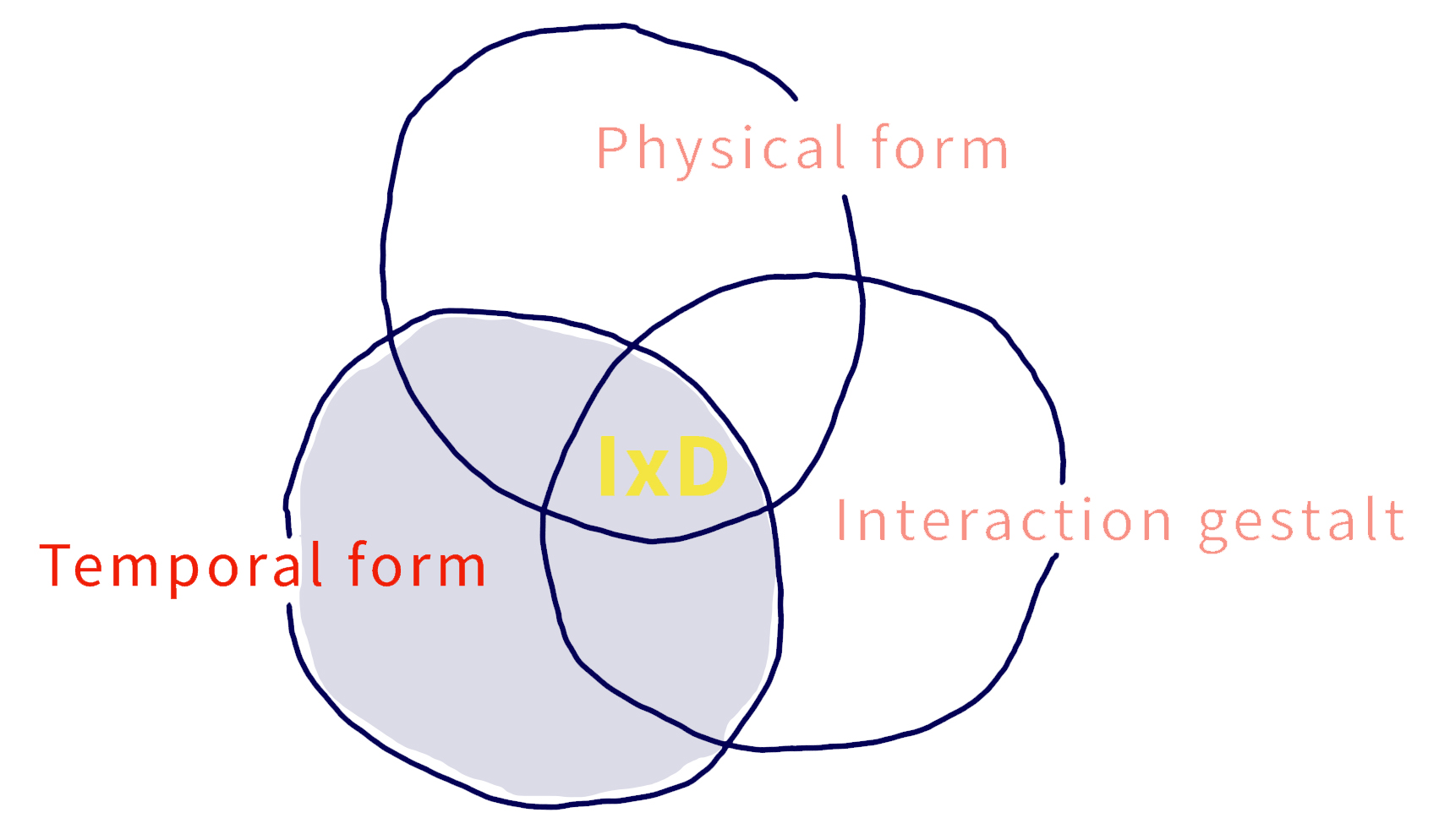
Looking back, I also found the article by Anna Vallgårda (2013) "Giving form to computational things: developing a practice of interaction design“ very inspirational. The trinity of form was a valuable way of structuring our work and putting words on our ideas. Throughout the process we have been navigating within the design spaces of physical materiality (physical form), technical functionality (temporal form) and interactional experience (interaction gestalt).
We experienced that our ideas at all times be be categorized as one of the form elements.
(Recommended read: PROJECT WORK / SUPERVISION / 03.04.18)
(Recommended read: PROJECT WORK / SUPERVISION / 17.04.18)
(Recommended read: PROJECT WORK / 24.04.18)
(Recommended read: FINAL PROJECT WORK BEFORE THE EXHIBITION / 01.05.18)
So, did we manage to create a coherent entity, aligning all three forms of our interactive lamp?
“The unique challenge for the practice of interaction design comes from the addition of the temporal form and the balance of designing with all three forms to create a coherent entity” (Vallgårda, 2013).
One of my main learnings from this design process has been to deeply understand what Buxton (2007) meant by saying “Design is compromising” (p. 149). Throughout this design process I definitely experienced interaction design as an ongoing negotiation between the three form elements. In the beginning of the design process, I guess that our main focus was the physical form and how it would be able to express the temporal form. Then we noticed, after some low-fidelity prototyping, that “[...] imagining is not the same as experiencing” (Hummels et al., 2007: 677) - the physical form did not afford the interaction gestalt to play out as intended.
(Recommended read: PROJECT WORK / SUPERVISION / 17.04.18).
This lead to a compromise of the physical form. But still, looking back, I would say that it was the physical form that guided and structured most of the design process.
A lot of questions arises in my head now that this process has reached its end.
Due to my limited knowledge of materials, assembling methods and the coding of the temporal form, was I then too limited in my approach? We started our design process working with the physical form - was that a mistake? Would it have been a more explorative way of working, if we had started our design process with sketching in code and hardware? Maybe then, the temporal form would have influenced the physical form even more that it does now?
One thing is for sure, I can definitely conclude that this entire design process have been a steep learning curve where I have developed a lot of new skills. I made some mistakes along the way, but I learned a lot from them. I gained a lot of new technical knowledge and the theories have heightened and shaped my understanding of interaction design as a practice.
*****
Buxton, B. (2007): Sketching User Experiences - getting the design right and the right design. Elsevier Inc.
Dahlsgard,P., Dindler, C., Fritsch, J. (2013) Design Argumentation in academic design Education, Nordic Design Research Conference, Copenhagen-Malmø
Hummels, Caroline, Kees Overbeeke, and Sietske Klooster. Move to get moved: a search for methods, tools and knowledge to design for expressive and rich movement-based interaction. Personal and Ubiquitous Computing 11.8 (2007): 677-690.
Marc Hassenzahl (2013): The Encyclopedia of Human-Computer Interaction, 2nd Ed:
https://www.interaction-design.org/literature/book/the-encyclopedia-of-human-computer-interaction-2nd-ed/user-experience-and-experience-design
Norman, Donald A. (2004): Emotional design: Why we love (or hate) everyday things. Basic Civitas Books
Norman, Donald A. (2013) The design of everyday things, Revised and expanded edition. Basic books
Vallgårda, A. (2013). Giving form to computational things: developing a practice of interaction design. Pers Ubiquit Comput, 18(3), 577‐592.
Wensveen, S. A. G., Djajadiningrat, J. P. & Overbeeke, C. J. (2004). Interaction Frogger: A Design Framework to Couple Action and Function through Feedback and Feedforward. DIS ’04 Proceedings of the 5th conference on Designing interactive systems: processes, practices, methods, and techniques, pp 177-184.

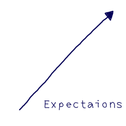
EXPECTATIONS
25.01.18
I HAVE GREAT EXPECTATIONS FOR THIS COURSE
AND I CAN NOT WAIT TO GET STARTED
I am looking forward to explore, to test ideas and to embrace the act of designing interactive artefacts.
I used to work in fashion and I am therefore comfortable and use to do a lot of prototyping and a lot of ‘learning by doing’ and I am really looking forward to using my hands and creativity in that way.
I expect to do a lot of sketching and prototyping but also to build up a theoretical vocabulary which will help me to become better at reflecting on, - articulate on - and arguing
for and through my design choices.
I hope to build up a strong language for talking about interaction design. I expect, that there throughout this course, will be a lot of exploration, interesting discussions and frustrating challenges and critiques which will help me move forward and become a more creative and skilled designer.
I am expecting to become good friends with Aduino and to explore the possibilities of sketching and prototyping with this technology.

DESIGN ARGUMENTATION
31.01.18
/ ARTICLUATING INTERACTIONS /
Both the text on Design Argumentation by Dalsgaard et al. (2013) and the text about the manifesto for a digital Bauhaus by Pelle Ehn (1998) argues on interesting angles when it comes to design driven learning and methods of teaching.
Dalsgaard et al. (2013) present design argumentation as an approach, which aims to teach students how to build up a shared design vocabulary in order to formulate valid claims. They build their approach to practice-based design teaching on the Toulmin model of argument. This model was made in order to explain and develop practical reasoning and to evaluate which argument has more explanatory power through discussion and justification.
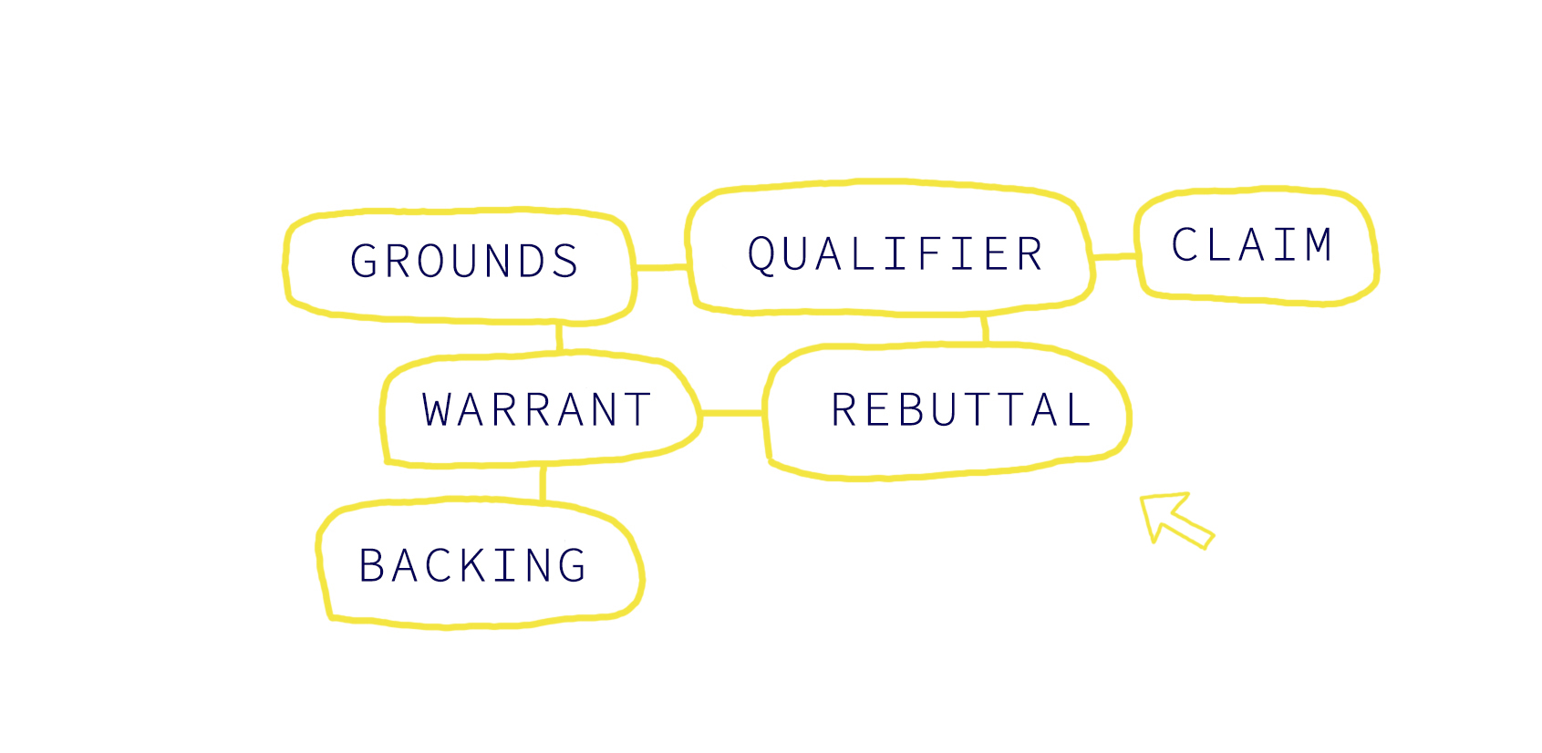
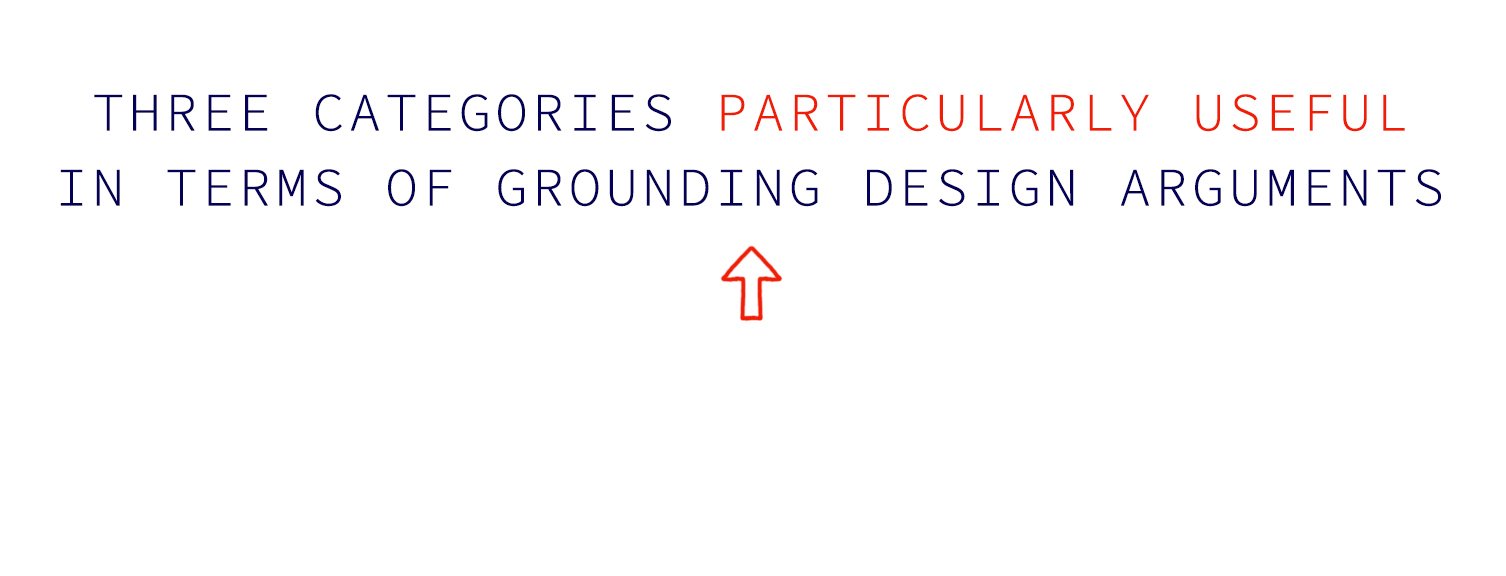
Dalsgaard et al. (2013) are inspired by all six categories, but found three categories particularly useful in terms of grounding design arguments.
According to Dalsgaard et al. (2013) design argumentation should be used as a way of creating structured exchanges between particular design objects and theory. This process can potentially go both ways and as a designer you can a make arguments for your design or arguments through your design.
Reading these two articles have been a reminder to me of the fact, that design of a product should always be grounded in a valid argument. In academic pratise, everything has to be accounted for, and put into words in order to describe which kind of knowledge one is producing and how. One of the reasons why I applied to ITU in the first place, was because I was hoping that design practice in an academic setting would give me the knowledge to become a better designer.
The part that motivates me the most in this article, is how to make arguments through my design, and this way get new knowledge through the process by using my design as the driving force to gain new theoretical and methodological knowledge.
*****
Pelle Ehn (1998) Manifesto for a digital bauhaus , Digital Creativity, 9:4, 207-217, DOI: 10.1080/14626269808567128
Dahlsgard,P., Dindler, C., Fritsch, J. (2013) Design Argumentation in academic design Education, Nordic Design Research Conference, Copenhagen-Malmø

FUNDAMENTAL PRINCIPLES OF INTERACTION ACCORDING TO:
DONALD NORMAN
09.02.18
/ ARTICLUATING INTERACTIONS /
This blog post, is a summary of Donald Norman’s fundamental principles of interaction followed by a short reflection.
Discoverability: According to Norman (2013) discoverability refers to whether it is possible to figure out how to use an object by interacting with it. It results from appropriate application of five fundamental psychological concepts: affordances, signifiers, constraints, mappings, and feedback.
Affordances: An affordance is a relationship (not a property) between the properties of an object and the capabilities of the agent that determine just how the object could possibly be used. Affordances determine what actions are possible and they have to be discoverable. Perceived affordances help people figure out what actions are possible without the need for labels or instruction.
Signifiers: If an affordance or anti-affordance cannot be perceived, some means of signaling its presence is required. Signifiers communicate where the action should take place. Norman (2013) uses the term signifier in a somewhat different way than it is used in semiotics. For Norman, the term signifier refers to any mark or sound, any perceivable indicator that communicates appropriate behavior to a person.
Constraints: Constraints limit the way an object can be used. This term refers to determining ways of restricting the kind of user interaction that can take place at a given moment.
Mappings: Mapping is the relationship between the elements of two sets of things. Mappings refers to the relationship between controls and their effects in the world. There are many mappings that feel “natural” but in fact are specific to a particular culture. What is natural for one culture is not necessarily natural for another.
Feedback: Feedback is communicating the results of an action and it must be immediate and informative. Feedback is essential, but it has to be done correctly and appropriately. Poor feedback can be worse than no feedback at all, because it is distracting and uninformative.
Conceptual models: A conceptual model is an explanation. It is usually highly simplified, of how something works. With a clear conceptual model, discoverability is enhanced and the user can figure out how to interact with the artefact.
I find Donald Norman’s fundamental principles of interaction highly relevant when aiming to understand an artifact. Looking at everyday things through the lens of these principles makes me more aware of why some artefacts helps easen my life and why certain artefacts does the opposite.
Donald Norman (2013) writes: “Note that there are many mappings that feel “natural” but in fact are specific to a particular culture: what is natural for one culture is not necessarily natural for another.” (p. 22) This made me reflect a little bit on the very complex term ‘culture’.
As I see it, culture is a constant state of change and the term is very much influenced by globalization and the interconnected way in which both people and information are shared and consumed across the world. We live in a world of mass-produced products, which might mean that cultural differences is getting less and less important when it comes to understanding ‘mapping’ and product design in general.
*****
Norman, Donald A. (2013) The design of everyday things, Revised and expanded edition. Basic books

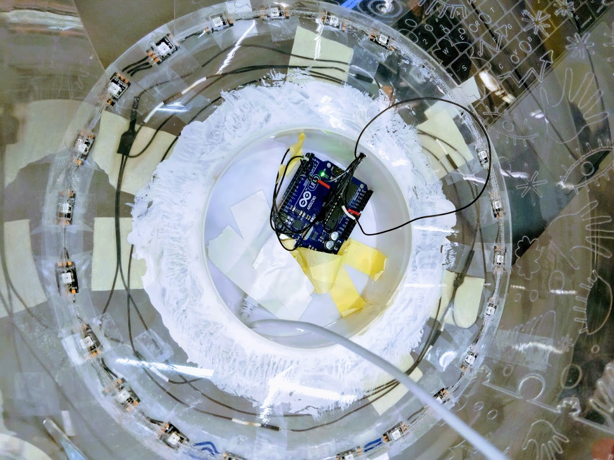
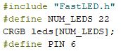
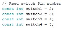
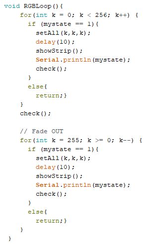
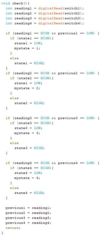
/ SKETCHING WITH CODE / ARDUINO / TRAFFIC LIGHT /
12.02.18
SKETCHING IN CODE & HARDWARE
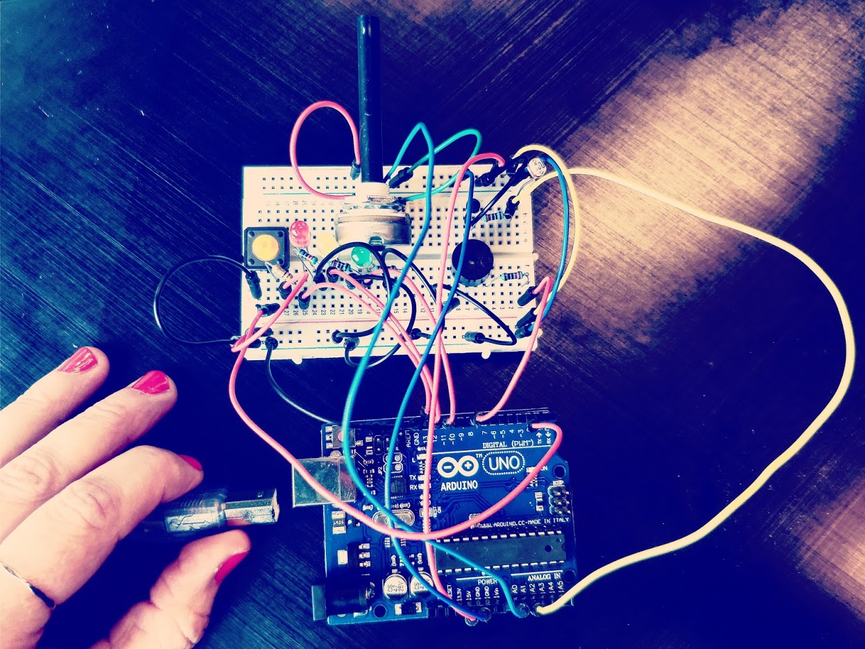
This is the very first time I have hold an Arduino in my hands. To be honest, the electronic kind of scares me - and also (for me) this new kind of coding (I only know the HTML5, CSS and JavaScript which this website is build on). So, I am aware of the fact, that there is a lot of tutorials waiting for me to be watched and learned from.
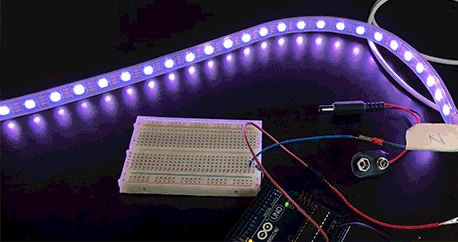
The first introduction to Arduino covered the physical board and its components, software, and a bit of code. I learned to made a circuit with LED light and experimented with changing different light behaviours.
I learned from the course DDKP on the 1st semester that coding, can not be learned during class, but that I have to put a lot of hours in practicing in front of YouTube tutorials. Luckily, I think that it is really fun and I hope that I will be just as excited about the Arduino as I was -and still am - with HTML5, CSS and JavaScript - So I went home and spend hours on practicing in front of YouTube tutorials.
My first high point when spending time with my new Arduino was when I finally figured out how to sketch (in code) my own version of ‘The Traffic Light’.
It helped me a lot in understanding and remembering the code, when I wrote down small explanation sides by side of the code.
(Please see the below GIF, code and explanations.)
TRAFFIC LIGHT
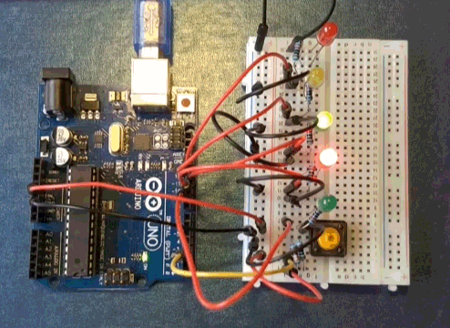
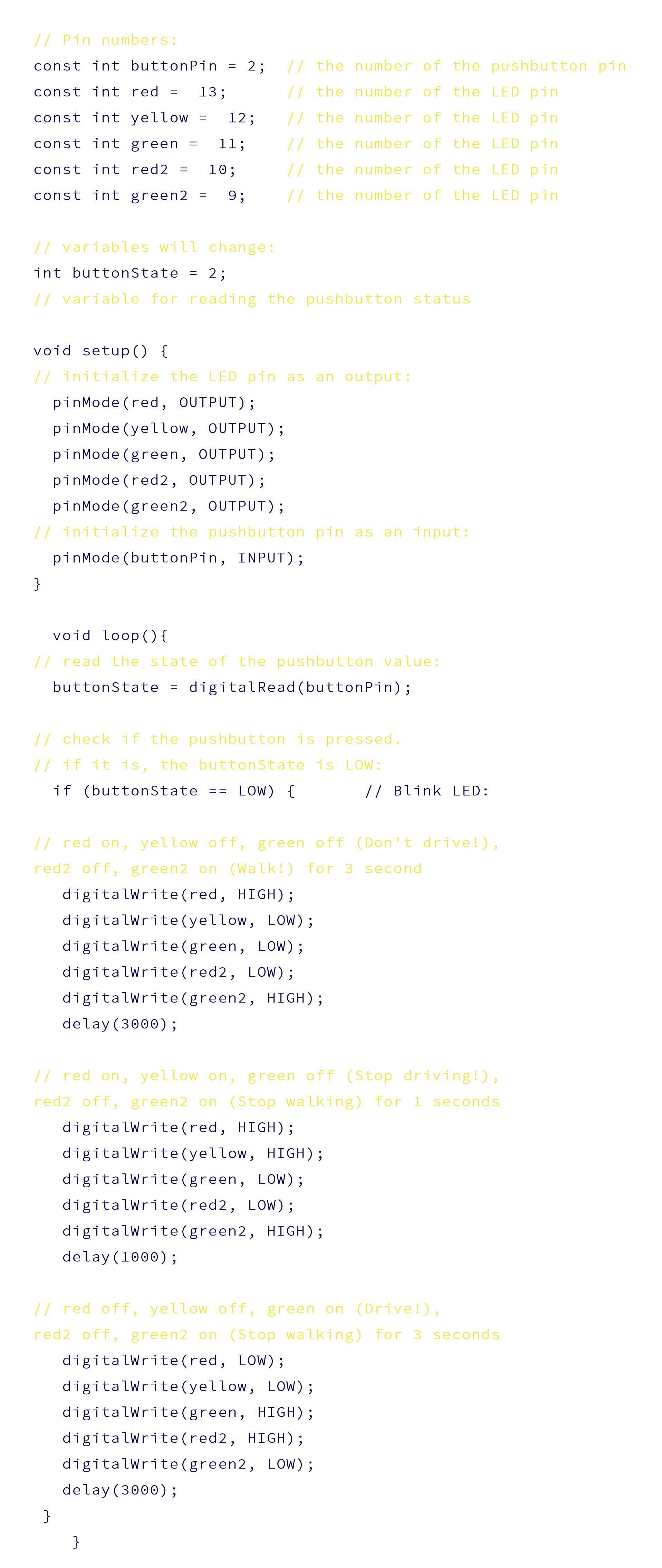
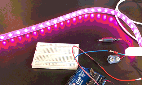
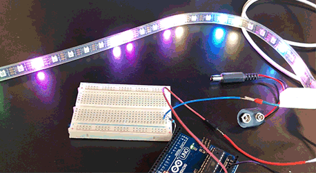
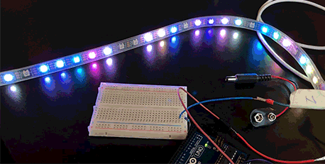
The GIF’s below are visualizations from some of the class exercises.
BLINK BLINK
HEARTBEAT
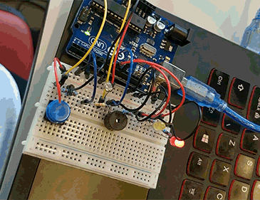
RED, YELLOW, GREEN

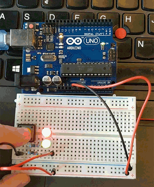
WENSVEEN, DJAJADININGRAT & OVERBEEKE: INTERACTION FROGGER
15.02.18
/ ARTICLUATING INTERACTIONS /
Wensveen et al. (2004) present the concept of coupling to describe how intuitive interaction is created through uniting the user’s action and an artifact’s reaction. They present a framework which gives the designer six practical characteristics for coupling action and information.
I like the idea of having a framework with six practical characteristics for coupling action and information, but I also find it challenging. I imagine that when we are about to design our interactive light it will be a challenge to get around and explore all six characteristics.
While the notion of feedback was presented as one of Norman’s (2013) seven principles of design, Wensveen et al. (2004) also present the concept of feedforward which is similar to Norman’s signifiers. The area of feedback and feedforward is needed whenever a designer is not able to establish direct couplings between action and function. In interaction design feedback is defined as the information the user receives about the effectiveness of his action and is often interpreted as ‘any type of returned information will do’. Wensveen et al. (2004) distinguish three forms of feedback: functional, augmented and inherent feedback.
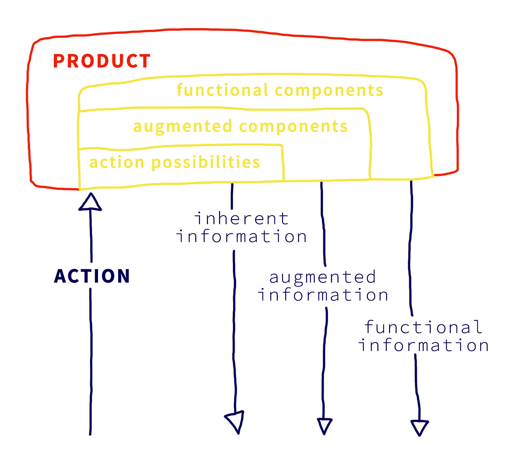
Functional: The information generated by the system when performing its function, e.g. sound, light or motion.
Augmented: The information not coming from the action itself (which is inherent feedback), but from an additional source. It appeals more to the cognitive skills of the user.
Inherent: The information that communicates what kind of action is possible. “Information provided as a natural consequence of making an action. It is feedback arising from the movement itself.” (Laurillard D., 1993) For example the feel and sound of the button when pushed is inherent feedback.
Feedforward is the information a given artifact offers which takes place before the user’s action. The same division of inherent, augmented and functional can be applied to feedforward.
Just as Norman’s fundamental principles of interaction this framework by Wensveen et al. (2004) helps me to get at deeper understanding of everyday artefacts. Wensveen dives more into detail with his terms and the subcategories one can work with as a designer or as a user of an artefact. In other words, knowing these principles makes me more aware of the details in a certain design.
I did find these principles complex and a bit difficult to grasp. But I also find them very interessting and useful which is why I decided to list them as above. This way these terms are clearer and easier to understand and relate to our future artefact later on when we start our design process.
*****
Wensveen, S. A. G., Djajadiningrat, J. P. & Overbeeke, C. J. (2004). Interaction Frogger: A Design Framework to Couple Action and Function through Feedback and Feedforward. DIS ’04 Proceedings of the 5th conference on Designing interactive systems: processes, practices, methods, and techniques, pp 177-184.
Norman, Donald A. (2013) The design of everyday things, Revised and expanded edition. Basic books.
Laurillard D. (1993) Rethinking university teaching: A framework for the effective use of educational technology. Routledge London.

EXPERIENCE DESIGN ACCORDING TO MARC HASSENZAHL
20.02.18
/ ARTICLUATING INTERACTIONS /
Marc Hassenzahl (2013) writes about how experience can be created and shaped through technology and how you as a designer deliberately can chose to design those experiences. He points out that Experience and User Experience is not about technology, industrial design, or interfaces, but that it is all about creating a meaningful experience through a device.
He says that experience have the power to add some meaning to our lives and western societies because he believes that we are shifting from a materialistic society to a post-materialistic society. We do no longer care about possessions and about having things. Instead we want positive experiences:
“studies show that experiential purchases (i.e., the acquisition of an event to live through, such as a concert, a dinner, a journey) make people more happy than material purchases (i.e., the acquisition of tangible objects, such as clothing, jewellery, stereo equipment) of the same value” (Boven and Gilovich 2003; Carter and Gilovich 2010).
I FIND THIS ARTICLE VERY INSPIRING.
I get inspired by this socially- or human driven innovation where we only use the technology as infrastructure, where the product is not the important factor and where the main focus become these meaningful experiences.
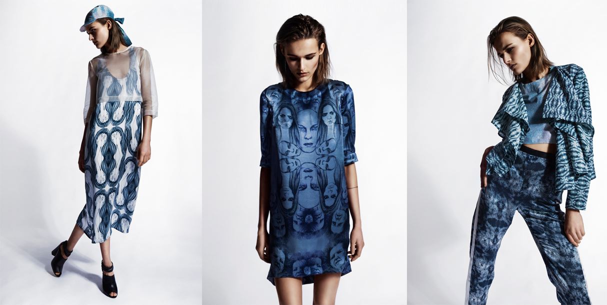
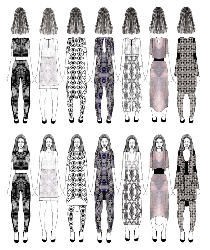
I really like the idea of telling a story through a product or putting a story into a product. This kind of thinking is not new to me. When I used to make clothing my main focus was always on the storytelling which was told mainly through handdrawn textile prints.
The photos and sketches below are from my bachelor project.
I would like to keep this focus and continue designing for these personally encountered experiences packed with psychological needs, emotions and meaning that only improve over time. These experiences, that enables me as a designer to become an author of stories conveyed through the product.
I found it very instructive and inspiring to also hear Marc Hassenzahl talk about these thoughts in this video interview:
*****
Marc Hassenzahl (2013): The Encyclopedia of Human-Computer Interaction, 2nd Ed:
https://www.interaction-design.org/literature/book/the-encyclopedia-of-human-computer-interaction-2nd-ed/user-experience-and-experience-design
Boven, Leaf Van and Gilovich, Thomas (2003): To Do or to Have? That Is the Question. In Journal of Personality and Social Psychology, 85 (6) p. 1193–1202

ARDUINO / DISCO
27.02.18
/ SKETCHING IN CODE & HARDWARE /
This blog post is just a small thought on the term ‘sketching i code’ which I had during today's lecture.
“When sketching in code, it’s okay to write bad code. You won’t hurt anything. As long as you get in there and start somewhere, as doing anything is always better than doing nothing. Making mistakes and learning what does work and what doesn’t, is an important part of learning anything new.”(Evans, 2011)
Since I do not have any experience in coding other than the bit of Arduino coding which I have done untill at this state of the course and the HTML, CSS and jQuery which this website is built on, I like the the phrase ‘sketching in code’. Until this point I did not explore the coding of Arduino as much as I would have expected and liked to do.
When that is said, I do have a lot of sketching practice when it comes to sketching with pen and paper and I do know that a sketch does not have to be perfect, but that sketching is all about being intuitive, practicing and quickly try out new ideas. Thinking of the Arduino program as a sketch definitely makes me more motivated.
*****
Evans B. (2011) Sketching in Code. In: Beginning Arduino Programming. Apress, Berkeley, CA

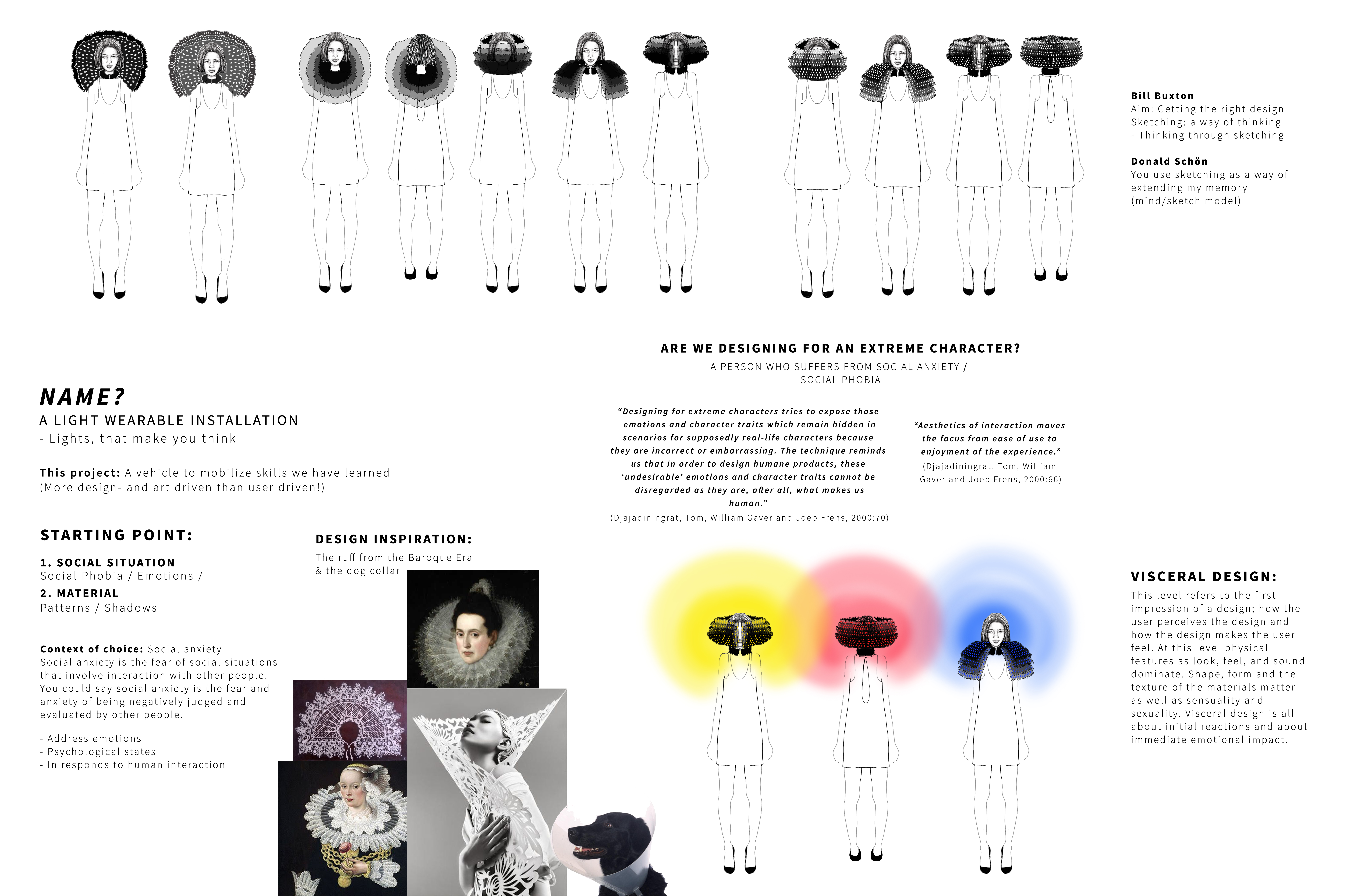
DONALD NORMAN (2004): THREE LEVELS OF DESIGN
Visceral, Behavioral & Reflective
05.03.18
/ ARTICLUATING INTERACTIONS /
According to Norman (2004) there are three levels of the emotional system: the visceral, behavioral, and reflective level. Each of these dimensions influences design in its own specific way. Each level is as important as the others, but requires a different approach when designing.
These three levels combined, forms the entire product experience.
Visceral design: This level refers to the first impression of a design; how the user perceives the design and how the design makes the user feel. At this level physical features as look, feel, and sound dominate. Shape, form and the texture of the materials matter as well as sensuality and sexuality. Visceral design is all about initial reactions and about immediate emotional impact.
Behavioral design: This level refers to the experience of a design in use and the emotions the user feel when a design is either accomplishing or failing to complete the user’s goals.
At this level it is all about understanding the user's needs. Good behavioral design should be human-centered which means that you as a designer must discover real needs that even the people who need them are not able to articulate. According to Norman it has to be a fundamental part of the design process from the very start because good behavioral design cannot be adopted once the product has been completed.
Reflective design: This level refers to the user’s reflections about the design, both before, during and especially after use. Reflective design is about message, about culture, and about the meaning of a product or its use and according to Norman (2004) the essence of reflective design is all in the mind of the beholder (p. 87).
This level refers to highly personal and subject factors and when you as a designer taps into the reflective level you must therefore take into consideration that users have different opinions, attitudes, memories, and life experiences.
"For one, it is about the meaning of things, the personal remembrances something evokes. For another, very different thing, it is about self-image and the message a product sends to others" (Norman, 2004: 83-84).
The reflective level makes me think about experience design according to Hassenzahl (2013) and what he says about the fact that we are shifting from a materialistic society to a post-materialistic society where we no longer care about possessions and about having things, but where we instead search for experiences.
Due to my background as a fashion designer, I have quite a lot of experience at designing for the visceral level, but I believe that the reflective level and experience design has only become more relevant since 2004 when Norman wrote this book. In many cases it is no longer enough that a product is just user-friendly or nice looking. A good design should be able to awaken feelings, tell a story or be able to tell something about who you are and thus add something extra to one's personal narrative or image.
My aim as a designer is to evolve from mainly designing for the visceral level to designing for the reflective level and create designs which based on and which offers meaningful and emotional experiences.
*****
Marc Hassenzahl (2013): The Encyclopedia of Human-Computer Interaction, 2nd Ed:
https://www.interaction-design.org/literature/book/the-encyclopedia-of-human-computer-interaction-2nd-ed/user-experience-and-experience-design
Norman, Donald A. (2004): Emotional design: Why we love (or hate) everyday things. Basic Civitas Books

LASER CUTTING / OUR FIRST LAMP
07.03.18
/ SKETCHING IN CODE AND HARDWARE /
Today we were introduced to our fellow group members and to the different IXD labs at ITU - Here, I especially noticed the laser cutter. Afterwards we got our first challenge, which was to quickly design and execute a lamp. We started playing around with paper and tried out different folding techniques, but we then decided on trying out the laser cutter. At first, we designed our own pattern, which we laser cutted in green cardboard.

We were inspired by the visceral level (Norman, 2004) and wanted mainly this level to influence our design. We wanted to create texture and patterns which - in compination with light would lead to aesthetic beautiful shadowplays.
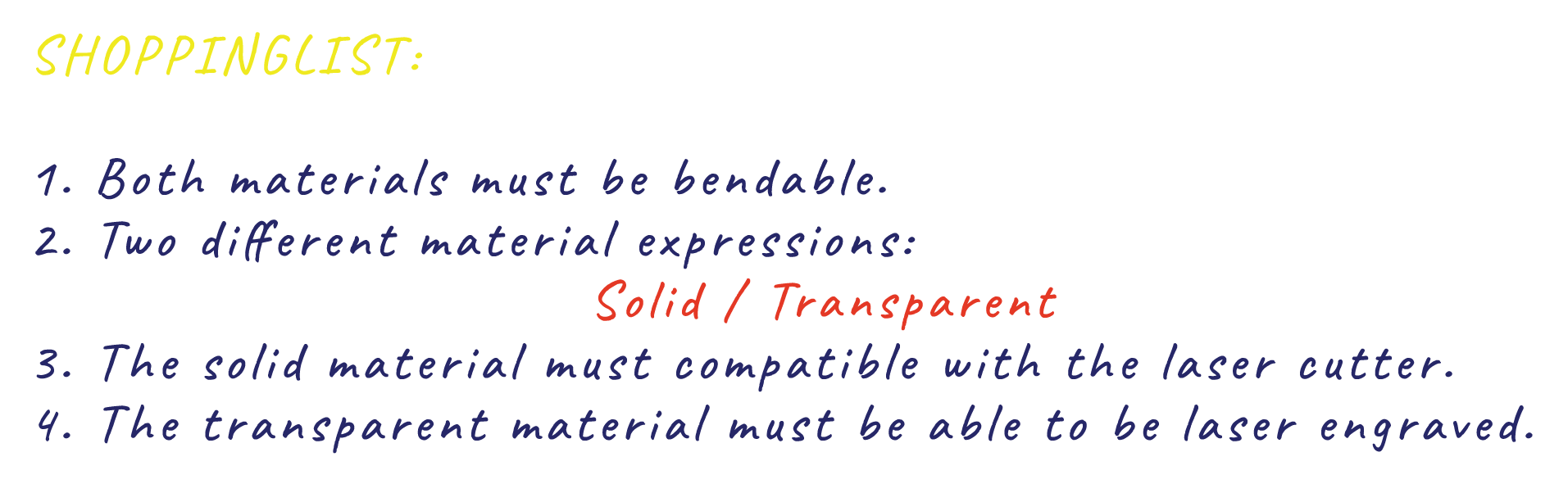
In the end, we unfortunately had to lower our expectations, because the of lack of time, and we went with a simple and solution. After some different iteration we ended up using a ready-made grid pattern which affords the wooden material, which we choose to work with in the end, to bend.
Looking back, I guess, taking the time frame into consideration, our final result turned out really nice.
*****
Norman, Donald A. (2004): Emotional design: Why we love (or hate) everyday things. Basic Civitas Books

/ WORKSHOP / MATERIAL EXPLORATION / MOVEMENT-BASED INTERACTION /
14.03.18
Hummels et al. (2007) writes about movement-based interaction as an important practice, not only for users but for designers as well.
“the world is inherently meaningful for our body and by moving and interacting we access this meaning.” (Hummels et al., 2007: 677)
I find this text very inspirational because I think that the methods and tools which Hummels et al. introduces are a very important when designing interactions. Movement-based interaction is important because:
“[...] imagining is not the same as experiencing” (Hummels et al., 2007: 677)
“[...] one has to move in order to design movements. (Hummels et al., 2007: 680)
It makes me think of how important it is, that I not only sit in front of my computer at my desk. I have to remember to use my body as a whole and my hands as much as possible whenever I am in a creative design process.
I have often experienced that when I ‘get out of my brain’ and 'into my body' I also start to see matters from other perspectives. It makes me think of new things that turns out to be essential for the design process and final result. This is often when the more interesting ideas occur to me.
Movement-based interaction and the fact that "imagining is not the same as experiencing" and "one has to move in order to design movements" has a good connection to the workshop, which we had today. The main purpose for this workshop was to look closely at the action possibilities of the different objects we brought and to explore opportunities for various kinds of expression, and force a remapping of functionality.

I brought an old fashioned hole puncher, but after exploring its different action possibilities it turned out that the most interesting thing about this artefact was the movement that took action when the hole puncher was turned upside down and the small cut out circles of paper fell out of the hole puncher and to the floor.
*****
Hummels, Caroline, Kees Overbeeke, and Sietske Klooster. Move to get moved: a search for methods, tools and knowledge to design for expressive and rich movement-based interaction. Personal and Ubiquitous Computing 11.8 (2007): 677-690.

PROJECTWORK
20.03.18
/ BRAINSTORM, MATERIAL EXPLORATION & SKETCHING /
Today, we used different methods like brainstorm, sketching and moodboard to explore different topics and ideas and to visualize our design process.
We started with a brainstorm where the purpose was to try and find common ground in form of interests and contexts.
After the brainstorming session, we started sketching. As mentioned by Buxton (2007), the value does not lie in the artefact of the sketch itself, but in its ability to suggest and explore topics. We thereby used sketching as a means to visualize our ideas and to develop them further.
We discussed our sketches in the group and then decided to narrow them down by focusing on three ideas.
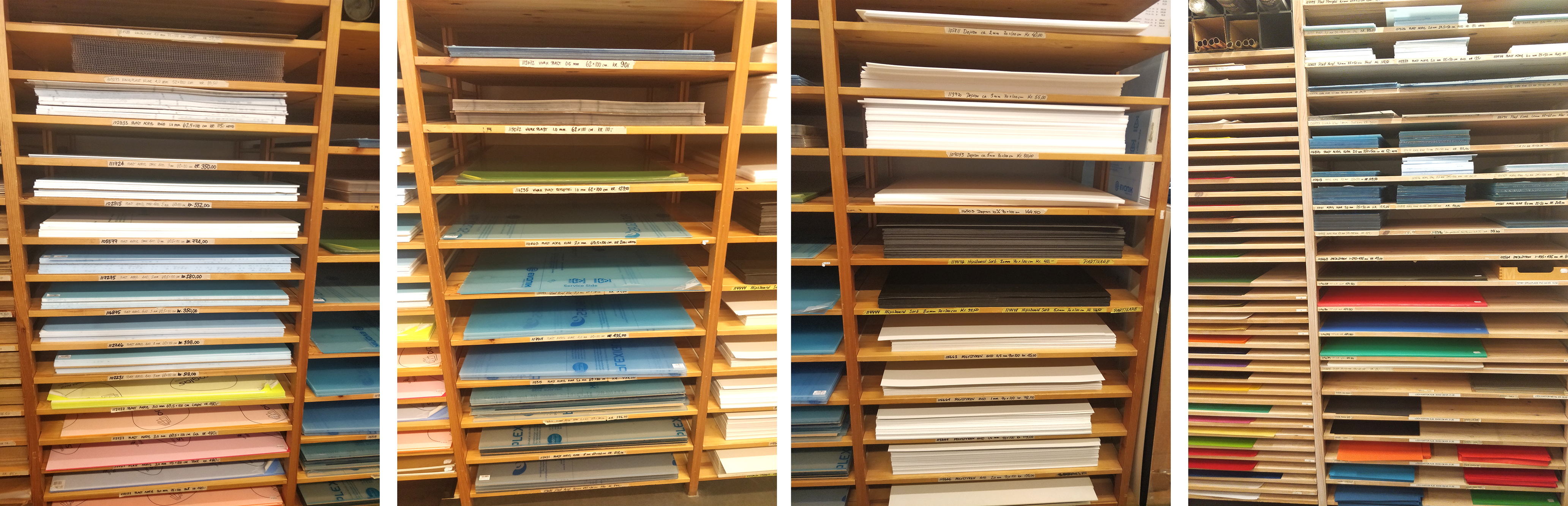
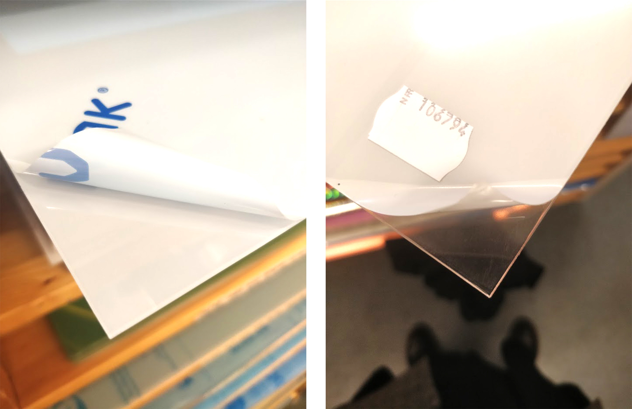
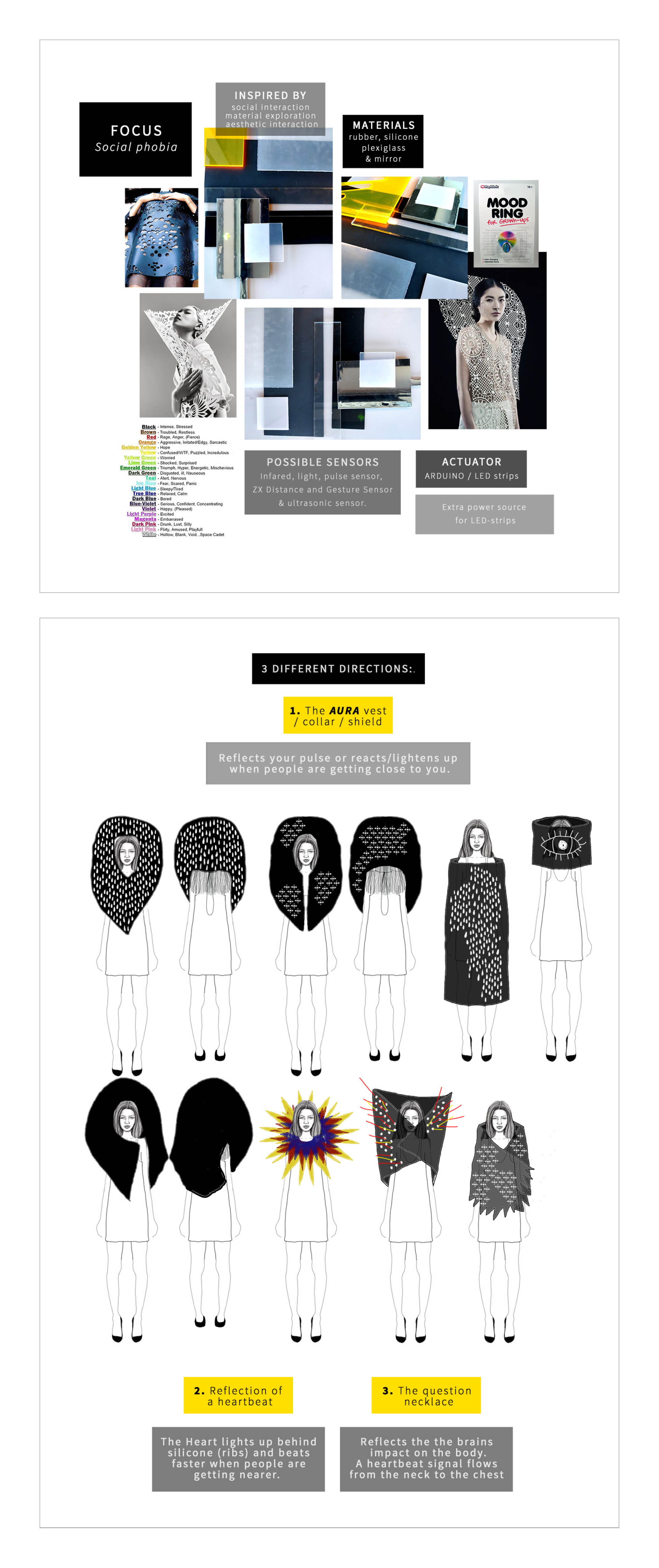
In order to gain some more inspiration and to get a better idea of material possibilities, we went to the IXD Lab and to IXD Dirty Lab to have a look at materials. We explored the different options and how these reacted together with light. We kind of knew at that point that we wanted to work with the laser cutter, so we also had that in mind when we explored our options. We choose some materials which had the affordances we were searching for and which also had a visceral quality in form of a visual appeal.
Afterwards we incorporated these materials into our moodboard and planned how to present this together with our three ideas at the Show & Tell session next week.
*****
Buxton, B. (2007): Sketching User Experiences - getting the design right and the right design. Elsevier Inc.

PROJECT WORK / SUPERVISION
03.04.18
/ CONCEEPTUALIZATION, EXPERIMENTATION, SKETCHING & PROTOTYPING /
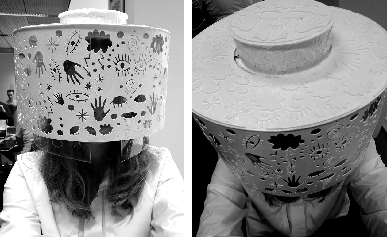
Today we presented our three ideas at the ‘Show & Tell”. Afterwards we decided on going further with the idea of something blocking the eyes and face of the person wearing the artefact.
We liked the idea of making a wearable light design. A wearble, which you can actually wear and not just carry around. Not a wearble as something you would buy in a store and wear, but as a piece of art, which main purpose will be, to shine light on the feeling of the chaos we imagine arises inside a person suffering from social anxiety. The idea is to design a wearable interactive light that illustrate what happens inside the mind of a person who suffers from social anxiety when the people around him or her, are getting closer.
This interaction of 'blocking off', raises some questions that drives our future sketching process:
How can we with an interactive light design shine light on the topic social anxiety?
How can the interactional experience of 'blocking off' be physically manifested in the properties of a wearable interactive light design?
How can we make the light behave so that it reflects the uncontrollable feeling of chaos, which we imagine arises inside your mind when you feel the need to block off the world?
Vallgårda (2013) propose this trinity of forms as a framework to unfold the practice of interaction design.
““[...] interaction design (IxD) must encompass all three form elements, which inevitably entail a complex web of interdependencies. They can never be fully separated; however, one of the form elements might slide into the background in certain setups” (Vallgårda, 2013).
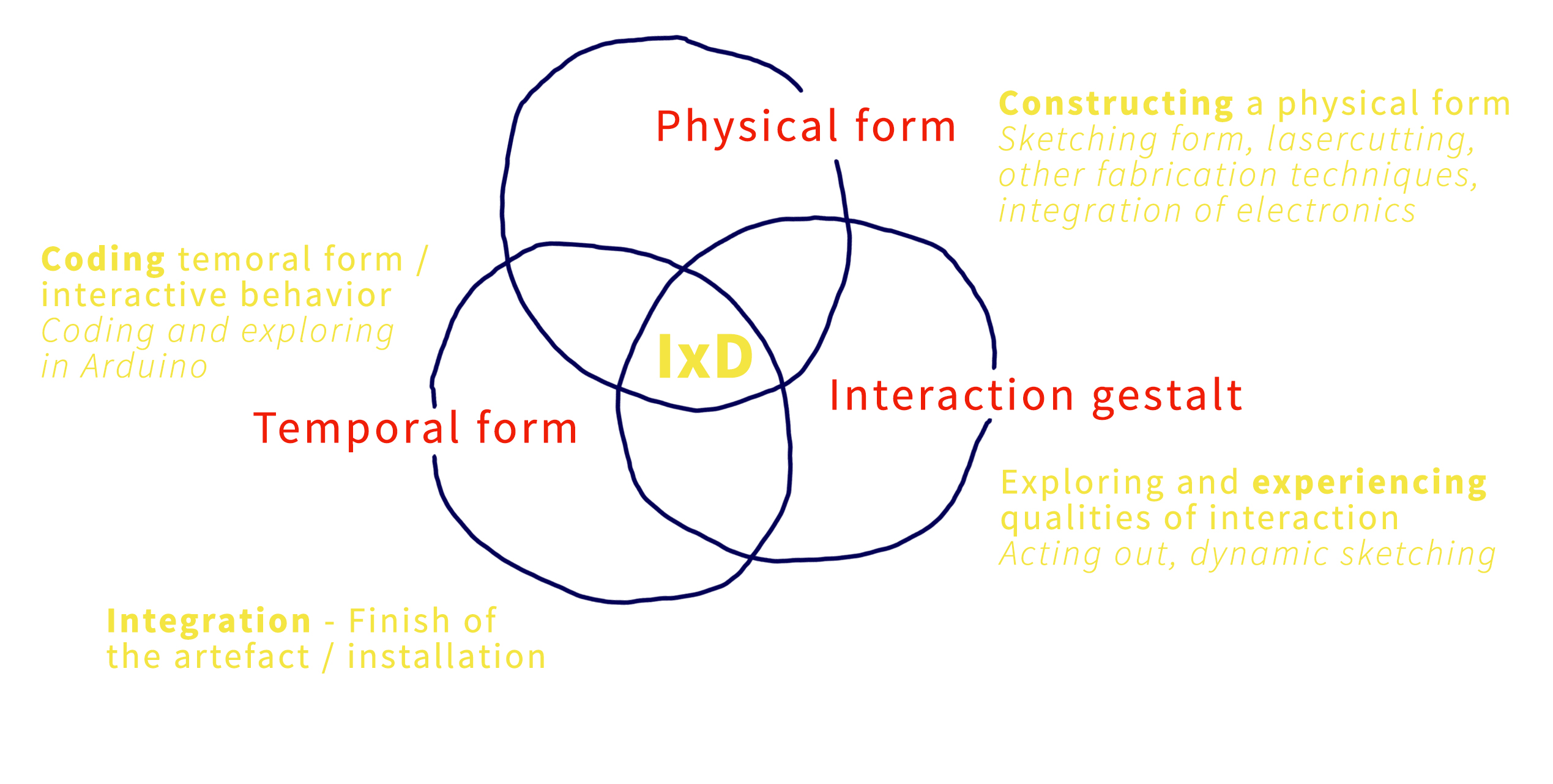
With Vallgårda’s model ”the trinity of forms” in mind, we took a step back into the ideation phase of our design process.
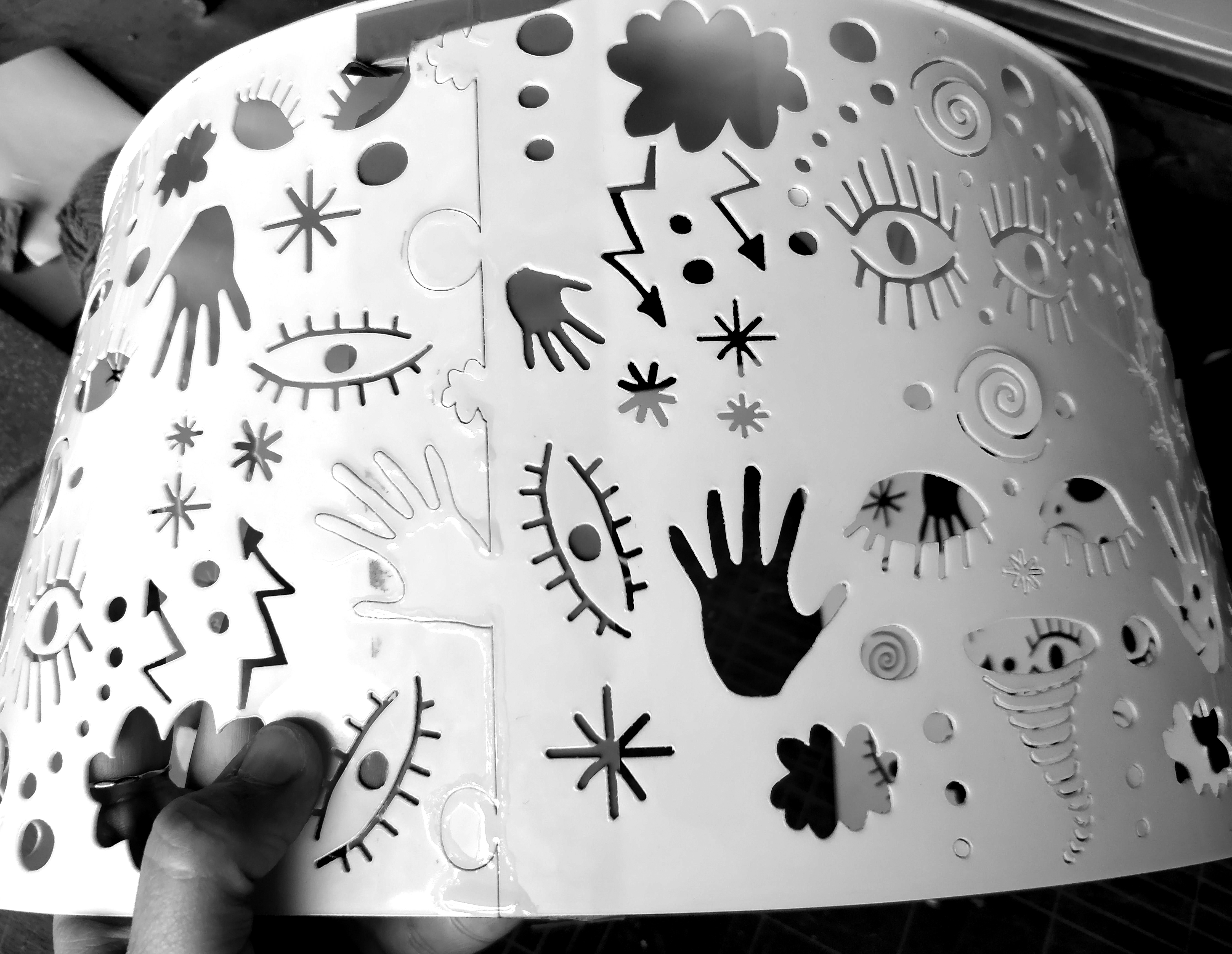
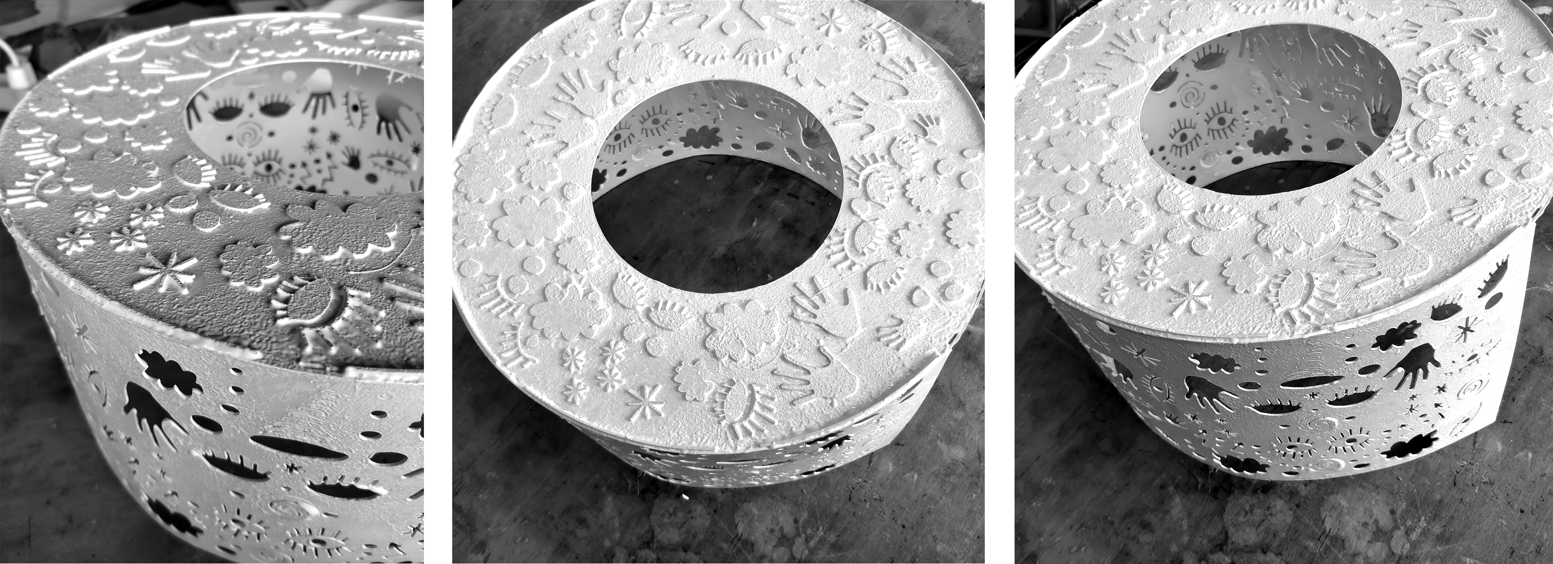
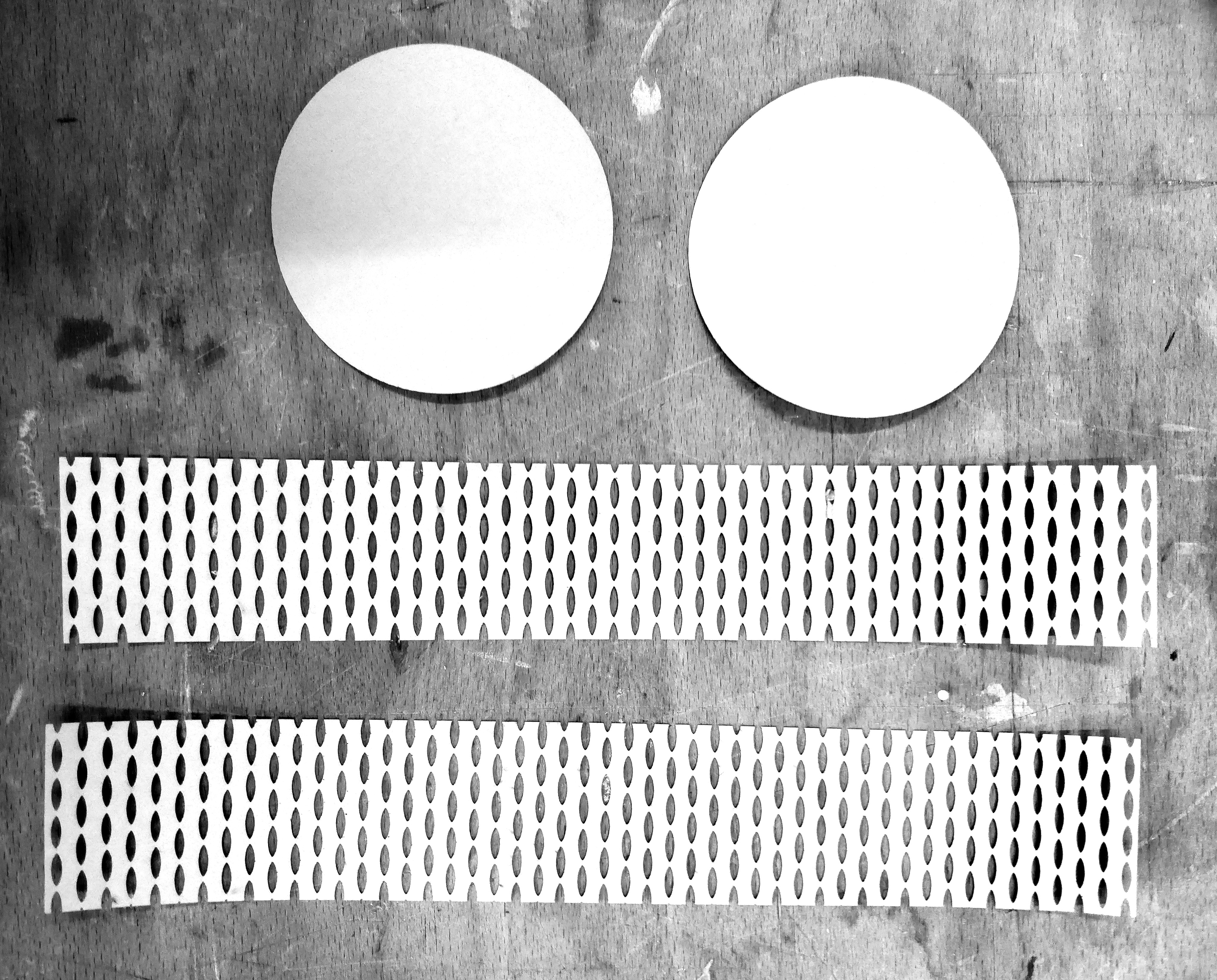
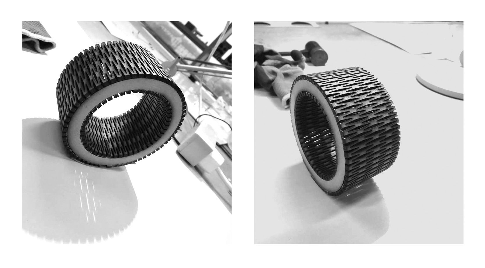
PHYSICAL FORM: We would like our light design to give an immediate emotional impact on it’s audience and therefore we also want the visceral level of Norman’s (2004) emotional system to influence this wearable light design. Therefore we will concentrate our work on shape, form and the texture of the materials. We want the shape to be simple and in contrast, we will make a laser cutted symbolic print, which in a very detailed, but abstract way tells the story behind this wearable light design.
INTERACTION GESTALT: The wearable light design must be constructed in a way so that it allows the person wearing it to either open up of block off when people are getting closer.
TEMPORAL FORM: When we think of a person suffering from social anxiety we imagine a chaotic and complex mind with a lot nuances. We will try to illustrate this state of mind through a turbulent, disordered and uncontrolled light in different colors.
When the person wearing the artefact chooses to ‘open up’ the light is calm and when the person wearing the artefact chooses to ‘block off’ the light gets chaotic and uncontrolled.
We presented our idea and the thoughts behind at super vision and we learned that we might would want to think about simplifying our temporal form and interaction gestalt, since we wanted the design to be mechanical and with a small motor.
The starting point and our next step in the design process will be in the 'Physical form' corner of Vallgårda’s model ”the trinity of forms", but with the other two corners close in mind.
*****
Vallgårda, A. (2013). Giving form to computational things: developing a practice of interaction design. Pers Ubiquit Comput, 18(3), 577‐592.
*****
THE MOODBOARD, SKETCHES AND NOTES BELOW ARE A VISUALIZATION OF SOME OF THE THOUGHTS AND REFLECTIONS WE HADE AFTER THE 'SHOW & TELL' SESSSION.

SUPERVISION / PROJECT WORK
17.04.18
/ UPSIDE DOWN /
After today's supervision session we discussed our above design ideas - the moodboard, sketches and prototypes and once again we became aware of the fact, that working with iterative design means that we continuously need to define and redefine what we think of as good design in relation to the context we are designing for. It is a never ending process of thoughtful reflection.
“Design should be seen as a conversation with the situation and as experimentation where we as designers have to be good ‘listeners’ and ‘readers’ of the situation” (Löwgren & Stolterman, 2007)
What we experienced today is also what Donald Schön describes as an ongoing conversation between the designer and the situation. A reflection-in-action and reflection-on-action process that helped us to understand some important aspects of what it means to approach a design situation (cf. Schön, 1987). The knowledge we gained from being forced to critical explore and discuss the advantages and disadvantages of our current design idea, helped us to rethink and to improve our design.
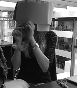
What happened was, that we were made aware of the practical constraints with the physical form of our ruff shaped wearable light design as it will be too difficult to balance it on ones shoulders.
“Designing is compromising” as Buxton (2007) puts it and the discussion, which we had today at the super vision session, lead to, that we literally decided to turn our wearable light design upside down. This means that the physical form will ballance on top of one's head instead of on one’s shoulders.
(Please see the sketch and the prototype below.)
*****
Buxton, B. (2007). Sketching User Experiences: Getting the Design Right and the Right Design. Elsevier: San Francisco.
Löwgren, J. & Stolterman, E. (2007). Thoughtful interaction design. A Design Perspective on Information Technology. MIT press: Cambridge.
Schön, Donald. A. (1987). Educating the reflective practitioner: Toward a new design for teaching and learning in the professions. San Francisco.
PHYSICAL FORM / SKETCHING IN PHOTOSHOP